Company:
M & E House Cleaning Services
This family-owned business was established in 2000 and has grown over the years. Since the beginning, Miriam & Erick House Cleaning Services have had a maid logo for 22 years. The owners, Miriam and Erick, have decided their business image needs an update.
Here we have their current business card. The information on the business card is abundant but to the point. The business card is only one-sided: bringing an opportunity for the blank side.
Introduction
When I spoke to the owners, Mirian and Erick, they mentioned how in the beginning, they had hit a few obstacles in starting their company. They realized they wouldn't be the only company cleaning houses and didn't have an ample employee headcount. Nevertheless, they proceeded because they wanted to grow as entrepreneurs. They had faith in their strong work ethic and connections to aid them in their journey.
The Process
When discussing with Miriam and Erick the new logo, they explained the image of the maid because she represented what service they offer. Another aspect we discussed was the usage of names. They decided to go with Miriam's name present in the logo. They wanted some aspects of their line of work incorporated into the new logo.
I wrote down the first few words that came to mind: house cleaning.
cleaning supplies: vacuum, spray bottles, mop, broom
house: window and door
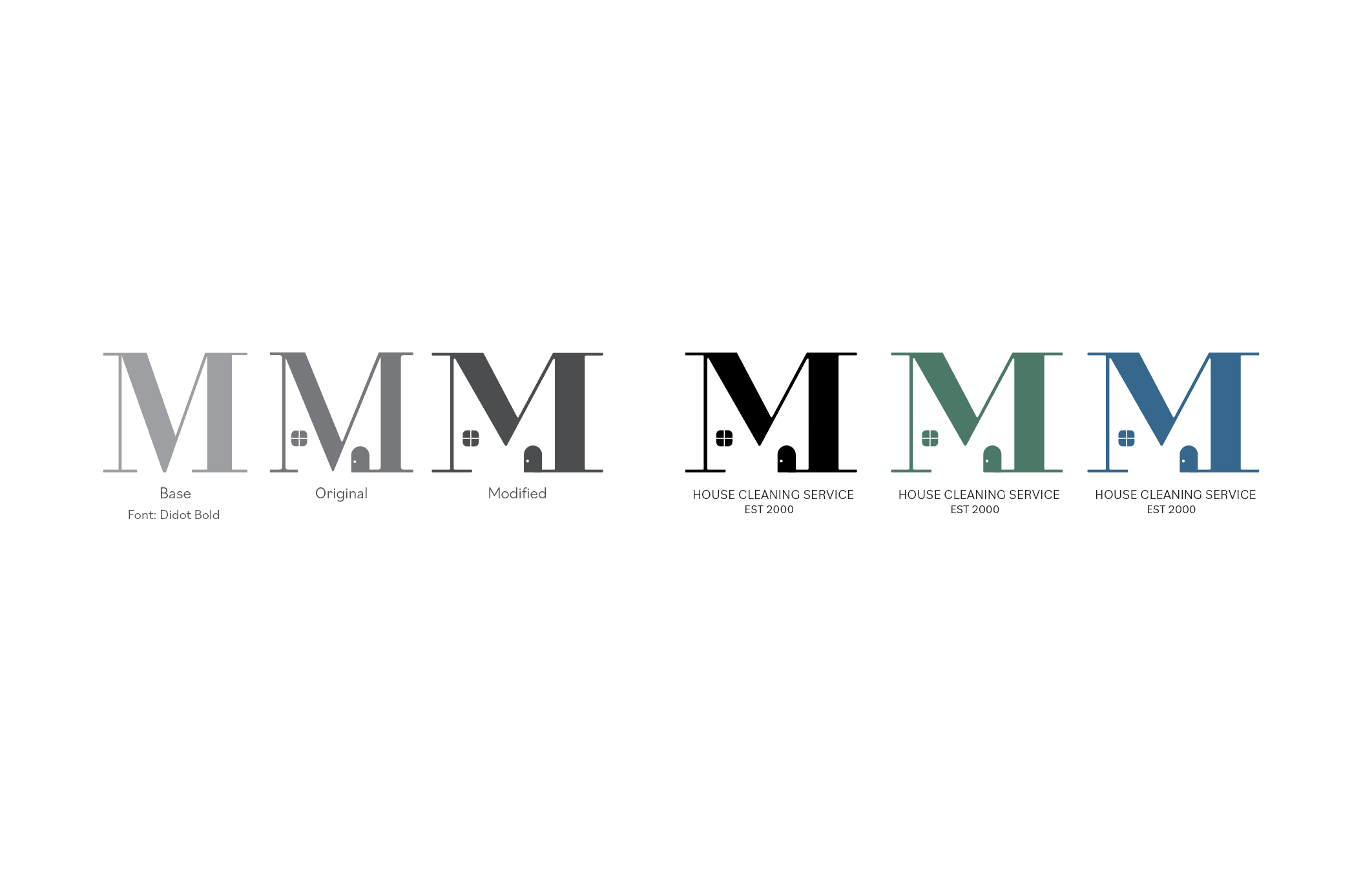
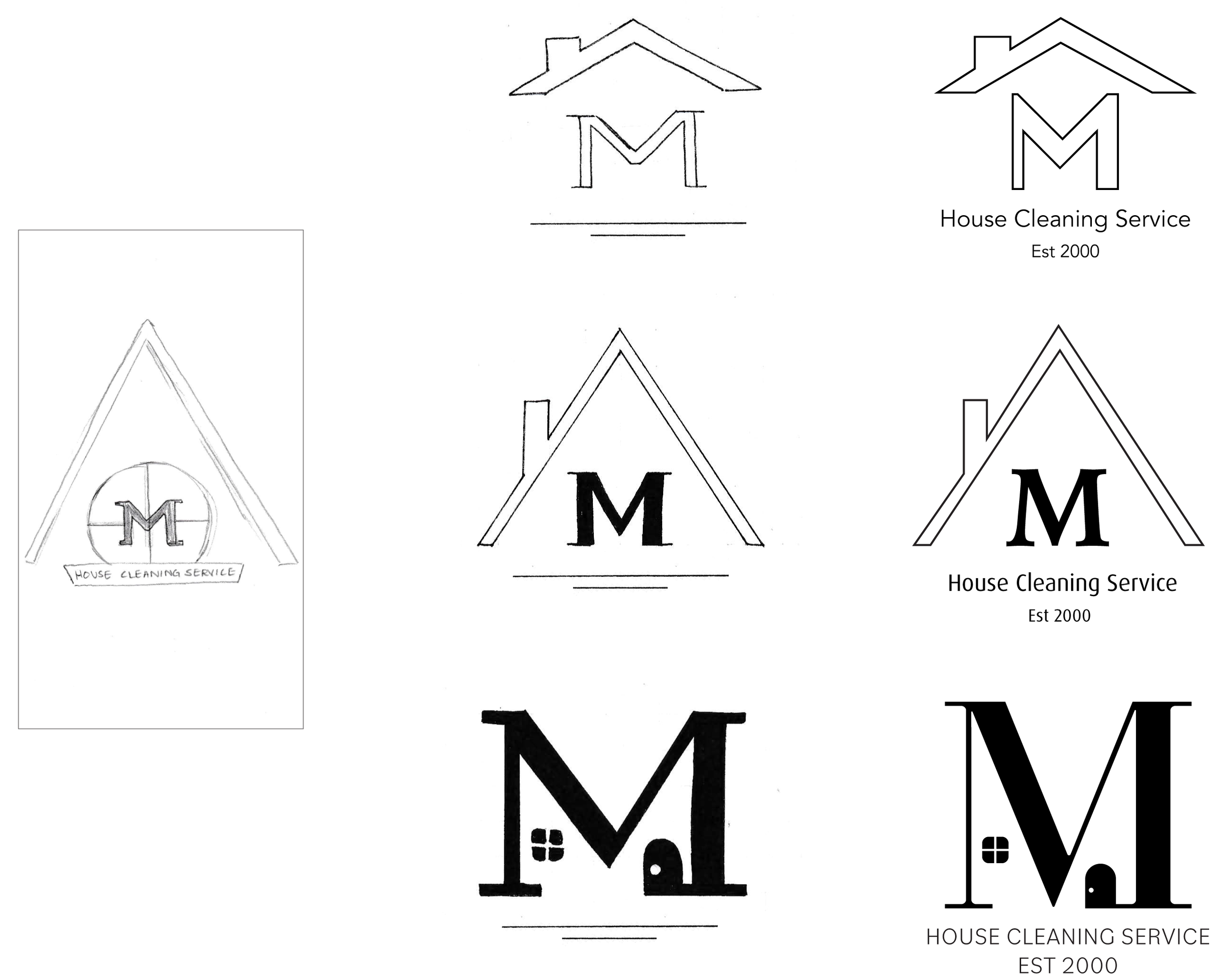
From this list, I created a few sketches. These sketches incorporate the tools with Miriam's name or her initials with the tools. Another sketch I did was with her initials and aspects of a house: roof, window, and windowsill. From these sketches, Miriam and Erick leaned towards the house. I then refined this sketch to three versions.


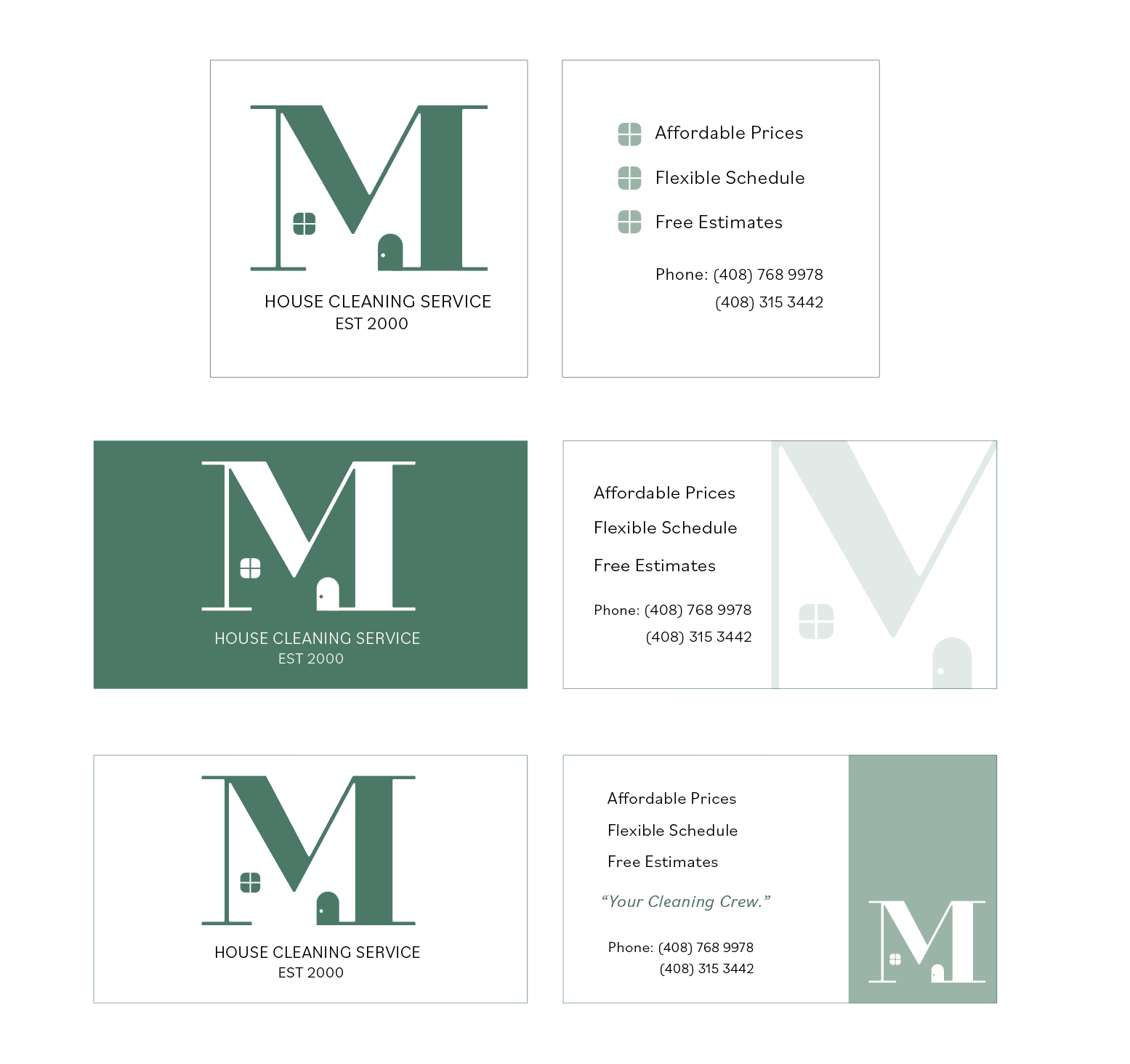
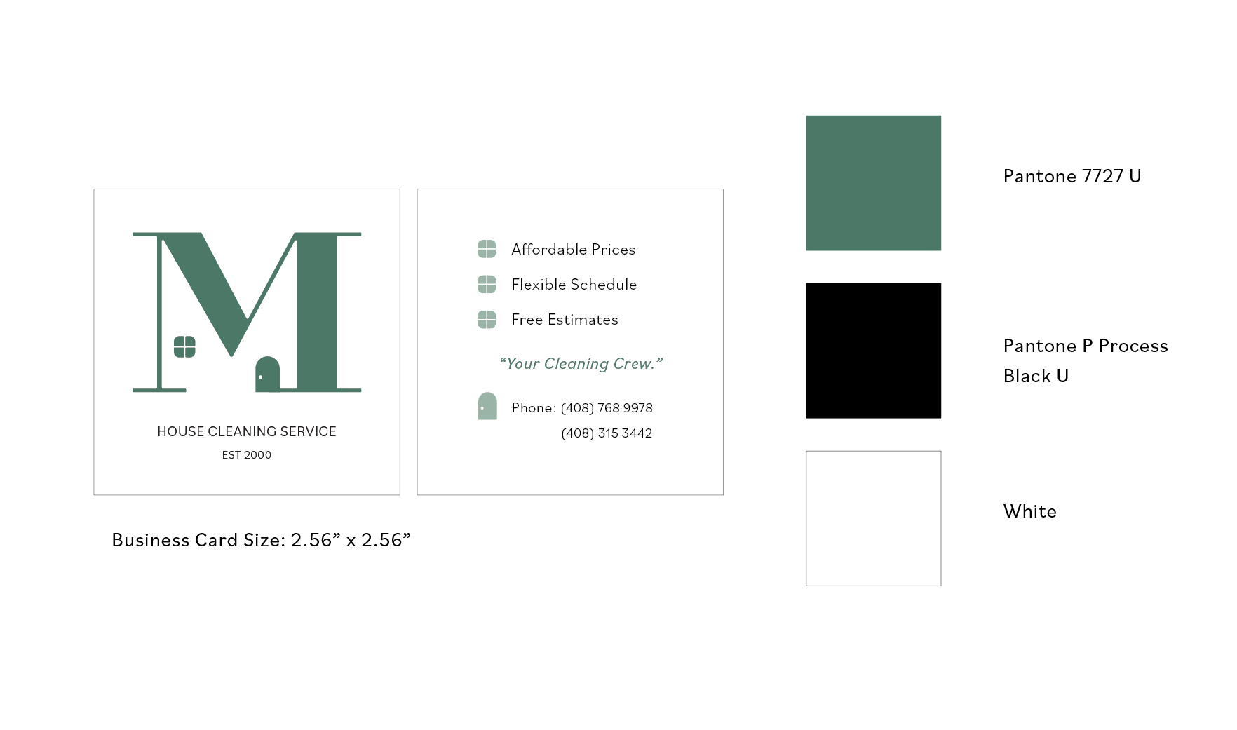
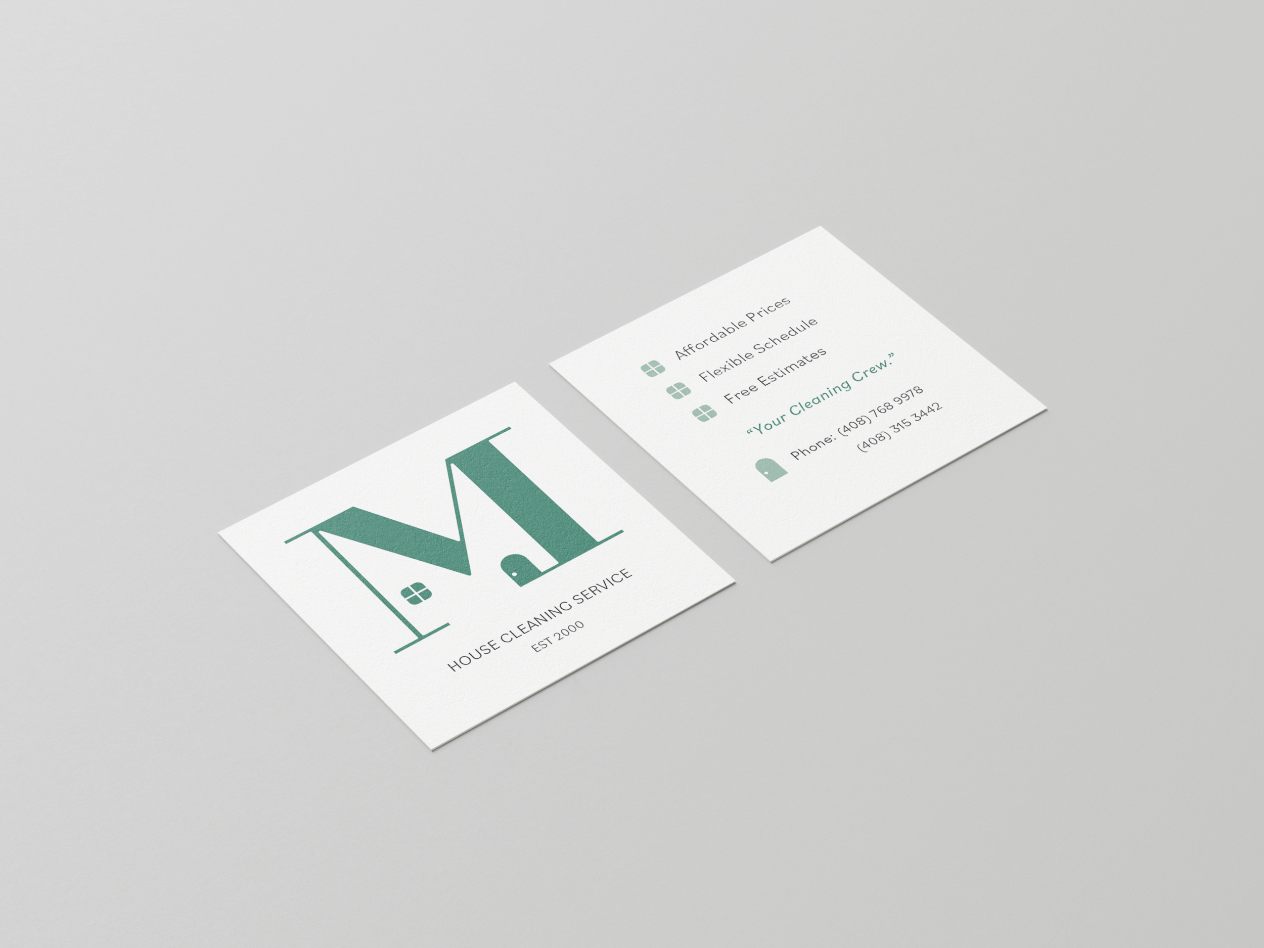
Miriam and Erick decided upon the last sketch to go forward with color and mock-ups. We explored color options for this choice. I explained that different colors had different meanings. We choose to stay in the green and blue spectrum. Since the original business card was one-sided, I used the front to hold only the name of the company and the rest of the information on the backside. I showed Miriam and Erick a black and white version and color to show how color affects the imagery. They decided to go with green for their brand. I then showed them two different business card sizes with the layout of the new logo.
