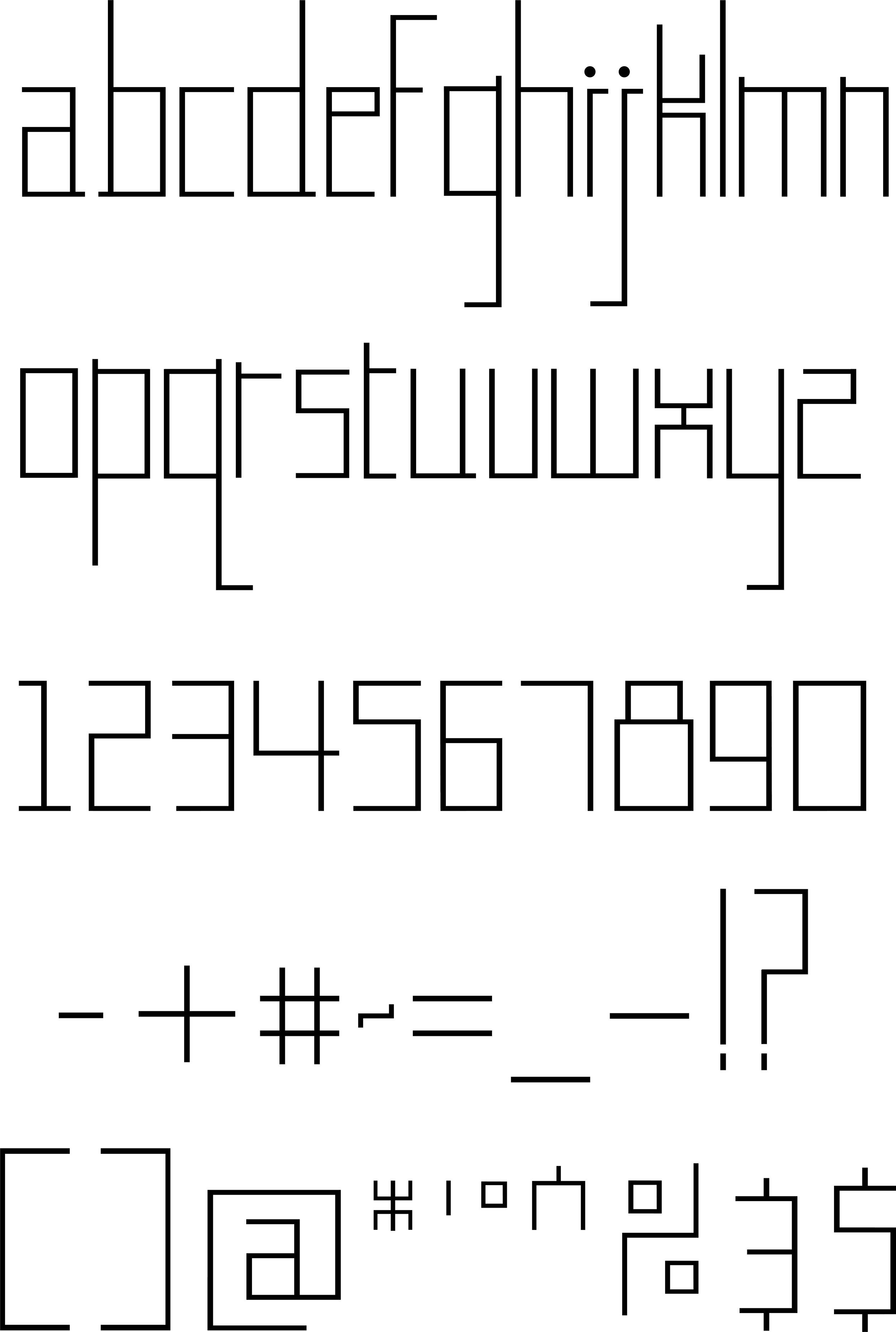
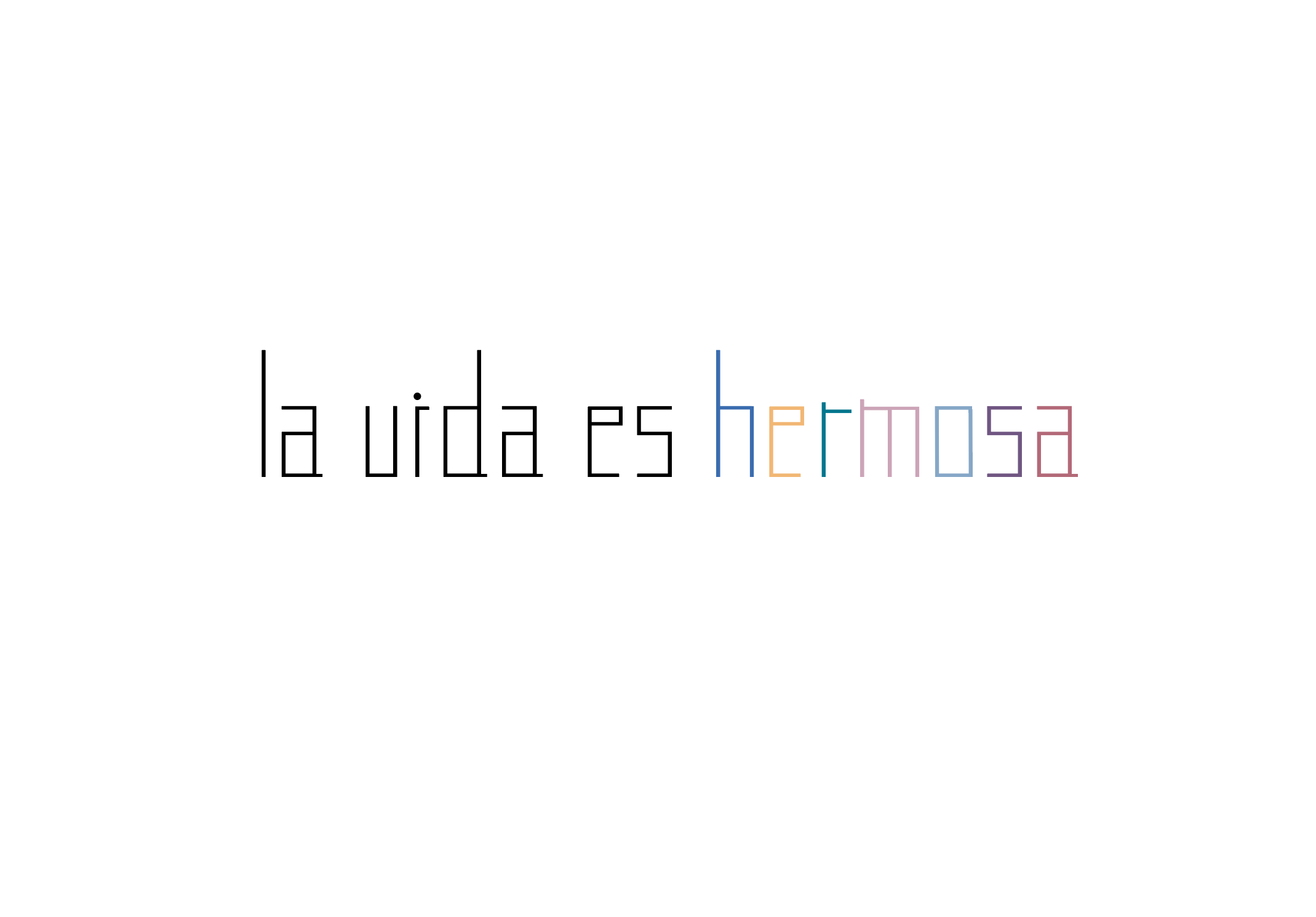
Display Typeface
I dove back into creating another display typeface to explore another concept I had in mind. I explored the geometric concept. I wanted a structure to this display typeface that would contrast the unruly display typeface I created before: Subconscious.
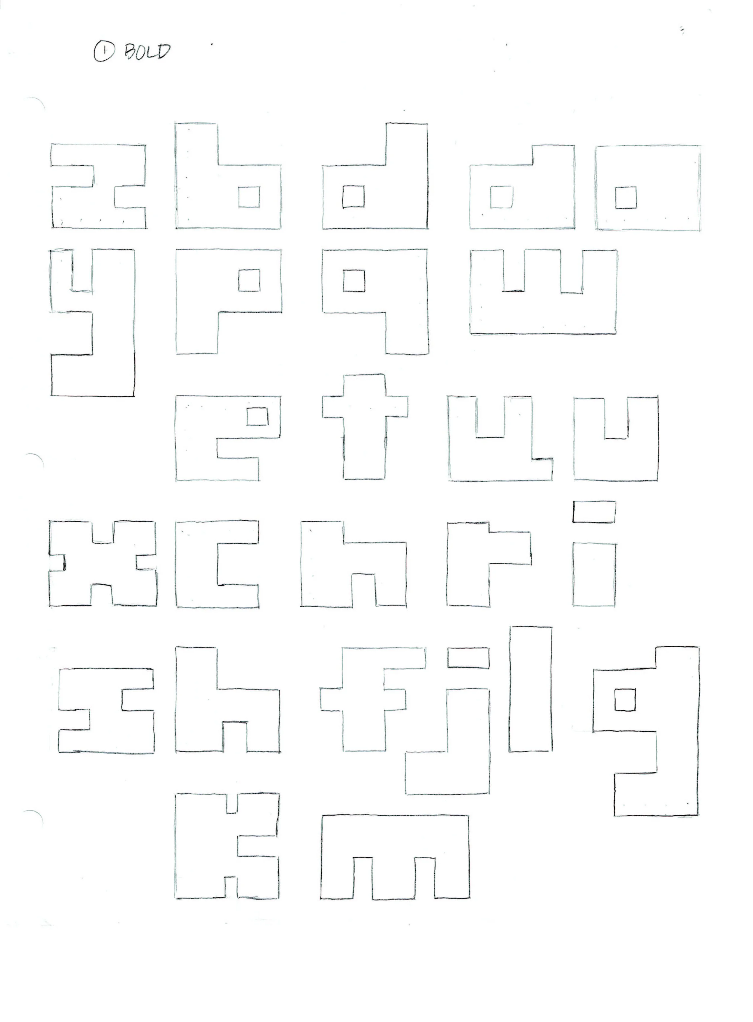
Step 1: Sketch
For this step, I drew out the letterforms on graphing paper to have a guide for the angles I wanted to implement onto the letters.

Step 2: Transfer
I made the overall letterform sharper using the pen tool in Adobe Illustrator. I wanted to only have 90° angles to have the bold geometric feel.
Revision
After making transferring this to Illustrator, I then looked at a different approach to the geometric typeface. For this, I looked at the letters a - e. I then removed the counter space of the letters a, b, d, and e to be left with the overall shape. Seeing the thin outline of the overall shape, I decided to make a reduced geometric letterform from this base. The next thought was, “How would the letters look like if the form was condensed and not a literal block?“


I then took this new form and explored the other letters. I gravitated more to this new form and expanded into numbers and some symbols. This new form and old form did push my letterform making with a few letters.
After finishing the alphabet, I will revise the letters k, s, and z along with the symbols ^ and &. These letters and symbols all have angles and curves that contrast the geometric style of the other forms. This is a great exercise in pushing the boundaries on how else can this form be represented?